Showing posts with label album cover. Show all posts

Friday, June 17, 2016

92. Kate Bush - Never for Ever


Flickr Download DeviantArt


Some record  album covers  translate okay to a smaller size – whether it be a CD booklet or a computer  thumbnail image.  Others, however, have rich  detail which  gets lost when the image is reduced.
Kate Bush’s 1980 album Never For Ever is one such album.

Painted by artist Nick Price, who had previously  provided the cover art for Bush’s 1979 Tour program, it features a myriad of fantastical creatures flying out from under her windblown skirt.  Symbolizing
dark and light,  a fang-baring bat and a swan are the  most predominant.  Bush described the cover as  “an intricate journey of our emotions:  inside gets outside,  as we flood people and things with our
desires and problems. These black and white thoughts, these bats and doves, freeze-framed in flight, swoop into the album and out of your hi-fis. Then it’s for you to bring them to life.” (Kate Bush Club newsletter, Sept. 1980) Music to Eat


My own personal observation  is that Nick Price  (at the instance of Kate)  was portraying a dreamy surrealism  in the tradition of the Early Netherlandish painter Hieronymus Bosch.  This album cover art
bears semblance  with The Garden of Earthly Delights which is attributed to Bosch.  In the work above, the original album cover art design is at extreme left.  Its right half was flipped and added on the
right in order to mirror itself. The unflipped right half was added farther on the right in order to mirror the flipped half. I would call this a 'Bush flip', somewhat the opposite of but not very much unlike
a Bosh triptych.


While the art of the  older masters was  based in  the physical  world of everyday experience,  Bosch confronts  his viewer with,  in the words of  the art historian  Walter Gibson,  "a world of dreams and
nightmares in which forms  seem to flicker and change before our eyes".  In one of the first known  accounts of Bosch's paintings, in 1560 the  Spaniard Felipe de Guevara  wrote that Bosch was regarded
merely as  "the inventor of monsters  and chimeras".  In the early  seventeenth century,  the artist-biographer  Karel van Mander  described  Bosch’s work as  comprising  "wondrous and strange fantasies";
however, he concluded that the paintings are "often less pleasant than gruesome to look at". wiki


Here's the work of Nick Price.


Painting by Nick Price, direction by Kate Bush. Album produced by Kate Bush and Jon Kelly. EMI (UK), EMI America (USA), Harvest (Canada) 1980.


Never for Ever has Kate Bush  sounding vocally stable and more confident,  taking what she had put into her debut single "Wuthering Heights"  from 1978 and administering  those facets into most of the
album's content.  Bush's dramatics and theatrical approach to singing begin to solidify on Never for Ever, and her style brandishes avid seriousness  without sounding flighty or absurd.  "Breathing," about
the repercussions of nuclear war, conveys enough passion and vocal curvatures to make her concern sound convincing, while "Army Dreamers" bounces her voice up and down without getting out of hand.
"Babooshka"'s  motherly charm  and flexible  chorus make it one of her best tracks, proving that she can  make the  simplest of lyrics work for  her through  her tailored vocal acrobatics.  The rest of the
album isn't quite  as firm as her singles,  but they all sport a more  appeasing and accustomed sound than some of her past works,  and she does manage  to keep her identity and  characteristics intact.
Mike DeGagne for AllMusic; abridged.


(A) Babooshka - Delius (Song of Summer) - Blow Away (For Bill) - All We Ever Look For - Egypt

(B) The Wedding List - Violin - The Infant Kiss - Night Scented Stock - Army Dreamers - Breathing


"Babboshka" music video from KateBushMusic on YouTube


Back to Gallery 3


Saturday, April 30, 2016

85. Patti Smith - Horses


Flickr Download DeviantArt


On the square original cover art design, the artist is a a bit off-centre to the left. That image has been positioned a bit off-centre to the right above,
and the sides were extended with the addition of flipped images of the portions required to fill the spaces required to make an 18X10 resolution image.
The whole image was then toned to sepia and posterized. Finally, the texture was applied with the Craquelure and Angled Strokes filters. 

The peeled-off effect works nicely on the overall image including the figure of the artist and at the same time she is being set apart from the background.
The bonus is the figure of the head of a horse viewed up front which just happened to appear at left.


The cover photograph for Horses was taken using natural light by American photographer Robert Mapplethorpe, a close friend of Smith's, at the Greenwich
Village penthouse apartment of his partner Sam Wagstaff. Patti Smith is depicted wearing a plain white shirt which she had purchased at the Salvation Army
on the Bowery and slinging a black jacket over her shoulder and her favorrite black ribbon around her collar. Embedded on the jacket is a horse pin that Smith's
friend Allen Lanier had given her. Smith has described her pose on the cover as "a mix of Baudelaire and Sinatra." The record company wanted to make various
changes to the photo, but Smith overruled such attempts. The black and white treatment and unisex pose were a departure from the typical promotional images
of "girl singers" of the time, but Smith maintains that she "wasn't making a big statement. That's just the way I dressed."

Writer Camille Paglia described the album's cover as "one of the greatest pictures ever taken of a woman." wikipedia


This is the original album cover art design.


No. 44, Rolling Stone, The 500 Greatest Albums of All Time; No. 84, Entertainment Weekly, The 100 Greatest Albums Ever;
No. 91, Rate Your Music, The 100 Greatest Albums of All Time; No. 291, The Virgin All-Time Album Top 1000.

No. 26, Rolling Stone, The 100 Greatest Album Covers; No. 45, Music Radar, The 50 Greatest Album Covers of All Time 


Photo by Robert Mapplethorpe. Album produced by John Cale. Arista 1975.


The simple black and white portrait gracing the cover of Horses was taken by Smith’s good friend, and photographer Robert Mapplethorpe. Smith had met
Mapplethorpe on her first day in New York City in 1967, when she accidentally wandered into his apartment looking for someone else. The two became close
friends, even sharing the smallest room at the Chelsea Hotel (as it was all they could afford), where they would stay up all night and work on their respective
art forms. Mapplethorpe has described his collaborations with Smith “like taking drugs; you’re in an abstract place and it’s perfect”. Lomography


(A) Gloria, Part I: In Excelcis Deo, Part II: Gloria - Redondo Beach - Birdland - Free Money

(B) Kimberly - Break It Up - Land, Part I: Horses, Part II: Land of a Thousand Dances, Part III: La Mer - Elegie


"Patti Smith "Land" (Horses/Land of 1000 Dances/La Mer(de))" music video from Singing Fools Video on YouTube.


Tuesday, March 29, 2016

82. Beastie Boys - Paul's Boutique


Flickr Download DeviantArt


This image comprises of the original album cover art design at left and two reproductions of the store front which were compressed in order to fit an 18x10 resolution screen.
The resulting image was then posterized and the original and the reproduction of the store front at centre were recoloured. Finally, the whole image was twirled.

The image is  reminiscent of the small shops lining the downtown streets  of the small cities in the Visayas and Mindanao  regions of the Philippines which I travelled for eight 
years from 1978 as an internal auditor for a commercial bank. In my first assignment, in Cotabato City, traces of reinforcing concrete were visible on the sides of several
buildings that were damaged during the devastating 1976 Moro Gulf earthquake.     


However, here's the real story.

The album cover folds out to show an (almost) 360-degree panoramic view as seen from the corner of the Ludlow and Rivington streets. As can be seen by the keen eye in the 
cover and album sleeve art, the address that is supposed to be Paul's Boutique (but can clearly be identified as Lee's Sportswear by the top sign) is on 99 Rivington Street,
where Rivington intersects Ludlow Street in Manhattan's Lower East Side. The Paul's Boutique awning sign was hung on the building specifically for the cover photo
shoot. Until early 2007, the building contained an eatery inside named Paul's Boutique in honor of the album. It was renamed Three Monkeys, and a new bar
was opened  across the  street called  Spitzer's Corner.  The cover photo  was  credited to Nathanial Hörnblowér,  the collective  nom de plume of the
Beastie Boys but was executed by Jeremy Shatan. New York Minute


Photo from wikipedia.


Here's the original album cover art design.


No. 51, Rate Your Music, The 100 Greatest Albums of All Time; No. 72, Entertainment Weekly, 100 Greatest Albums Ever;
No. 101, The Virgin All-Time Album Top 1000; No. 156, Rolling Stone, The 500 Greatest Albums of All Time. 


Photo by Jeremy Shatan, album produced by Beastie Boys, Dust Brothers & Mario Caldato, Jr. Capitol 1989.


Paul's Boutique — named after a Brooklyn store whose radio ad is tossed in the mix and whose picture graces the cover — surprises from the get-go. Instead of opening,
as Licensed to Ill did, with wall-to-wall drum wallops, it creeps up on you like an alley cat: A quiet organ and snare fade up as a mellow DJ voice dedicates the
ensuing set to (who else?) the girls of the world. Then, of course, drums rat-a-tat, and we're back in naughty-boy land. "I rock a house party at the drop of
a hat/I beat a biter down with an aluminum bat," snarls Horovitz on the opener, "Shake Your Rump." But even in the midst of this obligatory strutting,
the Boys slyly acknowledge their tarnished public image: "I'm Mike D, and I'm back from the dead," brags Diamond.

"A puppet on a string, I'm paid to sing or rhyme," adds Yauch. Rolling Stone


(A) To All the Girls - Shake Your Rump - Johnny Ryall - Egg Man - High Plains Drifter - The Sounds of Science - Three-Minute Rule - Hey Ladies

(B) Five-Piece Chicken Dinner - Looking Down the Barrel of a Gun - Car Thief - What Comes Around - Shadrach - Ask for Janice - B-Boy Bouillabaisse


"Hey Ladies" Music Video from emimusic on YouTube.


Friday, February 12, 2016

76. Alice Cooper - DaDa


 Flickr Download DeviantArt


A detail of the head of Voltaire, the French philosopher from the image above reveals that his face is formed by the figure of two merchants sitting at a slave market.


Slave Market with the Disappearing Bust of Voltaire is considered one of Salvador Dali’s most effective double image paintings. 

According to Dali, “Voltaire possessed a peculiar kind of thought that was the most refined, most rational, most sterile, and
misguided  not only in  France but in the entire world.”  He felt that Voltaire’s  philosophy of rational thought  enslaved the
mind to the ordinary and stripped life of its mysteries. More


The cover of DaDa, Alice Cooper's fifteenth studio album and his last with Warner Brothers, is based on the painting by the
Spanish Surrealist  painter Salvador Dali. It has now been revealed that Cooper had relapsed to drinking  heavily during the
recording of DaDa,  and had suggested  that the album  was a contract  fulfilment requirement for which  Warner Brothers
was not pleased.  Cooper reportedly has no recollection of recording DaDa due to substance abuse.  Cooper stated “I wrote
them, recorded  them and I don’t remember much  of any of that”.  In 1996 Cooper said that DaDa was the scariest album
he ever made,  and that he never  had any  idea what it was about.  There was no  tour to promote DaDa,  and none of its
songs have ever been played live. Full article


This is the original album cover art design.


Album produced by Bob Ezrin. Warner Brothers 1983.


Salvador Dali's own work has had no apparent references to Dada as an anti-art movement.

On the other hand, Dada or Dadaism
was a form of artistic anarchy born out of disgust for the social, political and cultural values of the time. It embraced elements
of art, music, poetry,  theatre, dance and politics.  Dada was not so much a style of art like Cubism or Fauvism;  it was more a
protest movement with an anti-establishment manifesto. More


(A) Dada - Enough's Enough - Former Lee Warmer - No Man's Land - Dyslexia

(B) Scarlet & Sheba - I Love America - Fresh Blood - Pass the Gun Around


Scarlet & Sheeba music video from Ricky Cooper on YouTube.


Thursday, February 4, 2016

75. Nick Drake - Pink Moon


Flickr Download DeviantArt


Nicholas Rodney "Nick" Drake (19 June 1948 – 25 November 1974) was an English singer-songwriter and musician, known for his acoustic guitar-based songs. He failed to find a wide audience
during his lifetime,  but his work has gradually achieved  wider notice and recognition.  Drake signed to Island Records  when he was 20 years old and was a student at the University of
Cambridge, and released his debut album, Five Leaves Left, in 1969. By 1972, he had recorded two more albums—Bryter Layter and Pink Moon. Neither sold more than 5,000 copies
on initial release.  Drake's reluctance to  perform live, or be interviewed,  contributed to his lack of commercial success.  There is no known footage of the adult Drake; he was
only ever captured in still photographs and in home footage from his childhood.

Drake suffered from major depression. This was often reflected in his lyrics. On completion of his third album, 1972's Pink Moon, he withdrew from both live performance 
and recording,  retreating  to his parents'  home in rural  Warwickshire.  On 25 November 1974, at the age of 26,  Drake died from  an overdose of  approximately 30
amitriptyline pills, a prescribed antidepressant. His cause of death was determined to be suicide. Source


Keith Morris was the photographer who took Nick Drake's photo for the cover of Bryter Layter (1970) and he was commissioned to photograph Drake for the
cover of Pink Moon. However, the photos were not used as Drake's rapidly  deteriorating appearance, hunched  figure and blank  expression were not
considered good selling points.  Island's creative director Annie Sullivan, recalled the difficulty in making a decision around the cover of the LP:
"I remember  going to talk to  [Nick], and he  just sat there, hunched up,  and even though  he didn't speak,  I knew the  album was called
Pink Moon, and I can't remember how he conveyed it, whether he wrote it down. . . he wanted a pink moon. He couldn't tell me what
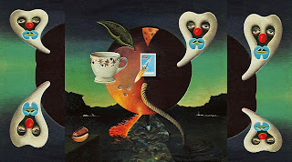
he wanted,  but I had  'pink moon'  to go on."  Island picked a  piece of surrealist  Dali-esque art by  Michael Trevithick,  who was
incidentally  a friend  of Drake's  sister  Gabrielle.  Although  Drake was  not outspoken  in his  opinion  on  the  cover art of
Pink Moon, many close to him felt that he approved.

David Sandison, Island's press officer stated that he found the original framed artwork for Pink Moon in among the
debris of the basement room that Island later  allocated to him as his office, and he took it home and hung it
on  the  wall  of  his  house  for  several  years,  before  eventually  presenting  it to  Drake's  parents.  An
undated photo of Drake's music room at his parents' house in Tanworth-in-Arden shows what appears
to be the artwork hanging on the wall. Full article


Classic Album Art through Ejay Frembeschi on Pinterest.


Pink Moon. It's so quiet and peaceful now.

Album produced by John Wood. Island 1972.


No. 131, The Virgin All-Time Album Top 1000; No. 321, Rolling Stone, The 500 Greatest Albums of All Time


(A) Pink Moon - Place to Be - Road - Which Will - Horn - Things Behind the Sun

(B) Know - Parasite - Free Ride - Harvest Breed - From the Morning


"Pink Moon" Song & Lyrics from dezzy94 on YouTube.


Back to Gallery 3


Friday, January 29, 2016

73. Radiohead - Pablo Honey


This work is all about honey - plus the album cover. The squares are meant to contain the viscosity of honey as the 12"x12" album sleeve was meant to contain the record of the music in it.
Those were in the olden days.  There were  already compact  discs when this album was released.  But that was not the difference I noticed.  What I did notice  was that the songs (which I
could now see instead of just hear) had now less melody and more 'bang' in them; more than heavy metal. And the one particular song that demonstrated this to me was "Creep."

On the literary side, I added the bee in order to be reminded that the word 'creep' has another meaning. 


(Lead guitarist Johnny) Greenwood  hated  playing "Creep" because he considered it too “wimpy.”  So, when they were recording it, he attempted  to sabotage it by maxing out his rack of
distortion pedals and hitting the strings as hard as he could before the chorus. The result became the song’s signature three blasts of guitar noise. Source


This album has "Creep" in it.

No. 301, The Virgin All-Time Album Top 1000


Art Design  by Icon, painting  by Lisa Bunny Jones, photo by Tom Sheehan.  Album produced by  Sean Slade  & Paul Q. Kolderie.  Parlophone, Capitol 1993.


Lead guitarist  Jonny Greenwood  got a bootlegged  tape of The Jerky Boys in the early '90s.  He became  obsessed with it and so did  the rest of the band.
They decided to name their debut album Pablo Honey after one of the prank calls in which the caller keeps saying, "Pablo, honey? Please come to Florida!"
The track “Pablo Honey” appeared a year later on The Jerky Boys 2 CD. Source


In a 2008 review, the BBC described the album as Radiohead's "exploration of suburban, adolescent  self-awareness", concluding:  "It all resulted in a stunning  blend that combined the best
aspects of prog rock (challenging lyrics,  deft chord changes,  novelty time signatures and so forth) with the plaintiveness of bedsit singer-songwriting and the sound of expensive equipment
thrashed at by experts. Though later albums were better received, this remains one of rock's most impressive debuts." The same year, Blender wrote: "Self hate couldn't have found a better
British exemplification  with this band's debut single,  which hit the world as part of an album that constructed walls of crunchy guitar tones amidst the dark lyrical content." In a review for
Amazon.com, British music critic Louis Pattison said of the album: "Pablo Honey. . . certainly, indie-rock seldom got better than this." Full article


(A) You - Creep - How Do You? - Stop Whispering - Thinking About You - Anyone Can Play Guitar

(B) Ripcord - Vegetable - Prove Yourself - I Can't - Lurgee - Blow Out 


"Creep" live at Belfort 1994 from 원준경 on YouTube.


Previous: Natalie Cole - Unforgettable
Back to Gallery 3


Monday, December 28, 2015

69. Blondie - Parallel Lines


Flickr Download DeviantArt


I've flipped the original image horizontally,  vertically and both horizontally and vertically and put them side by side without losing the parallel lines.  The length of the whole keyboard
runs parallel too - and it's there to remind us before we hit the wrong key - that these lines are parallel.


The idea for the sleeve was (the band’s manager) Peter Leeds’  idea who saw Blondie as being Debbie Harry with a band. With her incredible voice and good looks, maybe that’s the way
the public always saw Blondie too  but that wasn’t the way Harry or the band wanted it to be.  “I was not fond of Peter” Harry told Q magazine.  “He told the boys that they could all be
replaced, I was the only important one.”

While the  cover for Parallel Lines is widely regarded as  an iconic classic, ironically for the band  it’s a symbol of  manipulation and  contributed  to the dropping of Leeds as manager. “I
don’t think it’s a great design, personally” says Harry.  They all look like they’ve stepped out from a huge Bridget Riley Op-Art painting. Or is it piano keys?  The typography is perfect for
the sleeve and the era from which it came, the red matching Harry’s lipstick.

Looking at the sleeve for Parallel Lines, you’d be excused for not realising it.  Debbie Harry standing out in front of band in a dress that was a far cry from  some of the outfits she’d been
known for wearing on stage.  The band dressed in suits, their ties creating more parallel lines.  The only clue that things might  not be quite what they seem is the guys’ casual footwear.
The story, revealed in Q’s “The 100 Best Record Covers of All Time,” is really interesting and not at all what you’d expect. 

Apparently the  band were sold on the  idea that they would fade in and out of the stripes, which was the one  element they liked.  The facial  expressions – Harry’s sexy scowl contrasted
with the  guys’ goofy grins – were also Leeds’ idea.  According to Harry, he tricked them into pulling the  expressions once and then  proceeded to make the cover  without showing them.
“Everyone just flipped out” Harry said. “We were shocked that the artwork had been completed without our approval and that the decision had been made without the band.” Full article


Parallel Lines. Blondie was Deborah Harry and the boys.


No. 57, The Virgin All-Time Album Top 1000; No. 140, Rolling Stone, The 500 Greatest Albums of All Time.


Photo by Edo Bertoglio, lettering by Jerry Rodriguez, illustration by Frank Duarte, art direction and design by Ramey Communications.
Album produced by Mike Chapman. Chrysalis 1978.


Chapman took an unorthodox approach when recording with Harry who he describes as "a great singer and a great vocal stylist, with a beautifully identifiable voice. However, [. . .]
also very moody". Chapman was far more cautious of demanding much from Harry as he saw her as a highly emotional person who would vest these emotions in the songs they made.
He encouraged her to be cautious about the way she sang, particularly to recognise phrasing, timing and attitude.

Chapman would start with the basic track, which was difficult to record at the time by way of "pencil erasing".  He explained in an interview for Sound on Sound,  "that meant using a
pencil to hold the tape away from the head and erasing up to the kick drum.  If a bass part was ahead of the kick,  you could erase it so that it sounded like it was on top of the kick. 
That's very easy to do these days, but back then it was quite a procedure just to get the bottom end sounding nice and tight." 

After the basic track was complete, Chapman would record lead and backing vocals with Harry.  However, this process was hampered by many songs not being written in time for the
vocals to be recorded. When recording vocal parts, Chapman remembers asking Harry if she was ready to sing,  only for her to reply "Yeah, just a minute" as she was still writing lyrics
down. Chapman notes that many "classic" songs from the album were created this way.

Parallel Lines took its name from an unused track written by Harry, the lyrics of which were included in the first vinyl edition of the album. The cover sleeve image was photographed
by Edo Bertoglio and was chosen by Blondie's manager, Peter Leeds,  despite being rejected by the band.  The photo shows the band posing in matching dress suits and smiling broadly
in contrast to Harry who poses defiantly with her hands on her hips while wearing a white dress. Full article


www.nevermindthebuspass.com


(A) Hanging on the Telephone - One Way or Another - Picture This - Fade Away and Radiate - Pretty Baby - I Know But I Don't Know

(B) 11:59 - Will Anything Happen? - Sunday Girl - Heart of Glass - I'm Gonna Love You Too - Just Go Away


"Heart of Glass" live from Valdano 1986 on YouTube.


Previous: Alan Hull - Pipedream

Next: Little Richard - Here's Little Richard


Back to Gallery 3